
A visitor lands on your site, and somewhere in the next few seconds you have to decide how you're asking for their email. Most opt-in page examples you'll find online just show a gallery for one format or the other, without explaining why that store picked it — and most teams choose the same way: once, early, out of habit, not because anyone compared a popup against a dedicated page for what their own traffic actually looks like.
The two formats exist because they answer to different moments. A popup interrupts a visit that's already happening — someone browsing, reading, maybe about to leave. A dedicated page is a destination someone arrives at on purpose, usually because a link or an ad told them exactly what they'd find there. Neither is a general-purpose "better" choice; each one matches a specific way a visitor showed up.
That's the actual criterion worth using: what did the visitor expect when they clicked whatever brought them here? Someone who clicked an ad promising a size guide, a discount code, or a downloadable checklist arrived with a specific expectation already formed — a dedicated page that delivers exactly that thing, with nothing else competing for attention, matches what they came for. Someone browsing a blog post or a product page with no specific promise attached wasn't expecting anything in particular, so a popup timed to a real moment in that visit — after they've read enough to be interested, or right as they're about to leave — fits without requiring them to have wanted this in advance.
Mismatching the two costs something specific, not just a vague loss of "conversion." Send ad traffic that was promised a size guide to a general homepage with an exit-intent popup instead, and the visitor never sees the thing they clicked for — that's a broken promise, and it reads as one even if the popup itself is well designed. Do the opposite — route ordinary blog browsing through a dedicated landing page before they can read anything — and you've added a click nobody asked for, in front of visitors who hadn't decided they wanted a lead magnet at all.
Opt-In Page Examples: The Popup Version
Since the popup side of this decision is where Popconvert fits directly, it's worth seeing what a real one looks like configured, not just described.
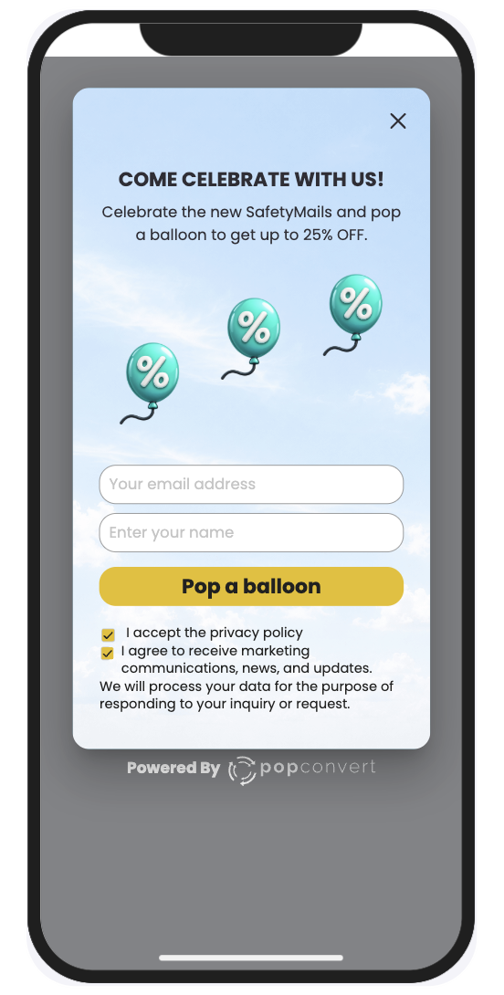
A popup built around this logic doesn't have to lead with a discount. The trigger decides when it appears — Exit Intent for someone who's about to leave without acting, Scroll for someone who's read enough of the page to signal real interest, Time for a shorter delay that catches early browsers on content-light pages. The reward attached to it can be a percentage or fixed discount, but it can just as easily be a non-monetary text reward — early access, a downloadable resource, free shipping — when a straight discount doesn't fit the product or the brand.
How to Configure This
Start from the situation, not the tool: decide which visitor moment you're actually trying to catch before opening the campaign builder. A store with long, content-heavy blog posts and a real return-visitor base gets more out of a Scroll trigger, since it only reaches people who've already shown interest by reading. A store with mostly first-time, ad-driven traffic and shorter pages is usually better served by Exit Intent, since there's less content for a scroll threshold to measure against in the first place.
Once the trigger is set, the reward is the second half of the same decision. A Percentage or Fixed Value discount works when the visitor already has purchase intent — they're weighing whether to buy, and a discount answers that directly. A Text reward — early access, a free resource, a longer trial — fits earlier-stage traffic that isn't ready to buy yet but might still be worth capturing for later. Matching the reward type to where the visitor actually is in that decision does more for the opt-in rate than the visual design of the popup itself.
For the case this article opened with — qualified traffic already on the site, deciding between formats — the popup, timed to a real behavioral signal instead of shown to everyone on arrival, is usually the right default. A dedicated page still earns its place the moment there's a specific external promise to deliver on; the two aren't in competition, they're answers to different questions about how the visitor got there.